Developing a new innovative digital brand
OSO.Earth
OSO helps businesses thrive by equipping their workforce with the necessary tools, knowledge and connections to improve their mental wellbeing and live a life of purpose through collaborative environmental action.
They believe that while solutions to the climate crisis exist, societal inaction stems from psychological barriers, such as fear and discomfort, associated with acknowledging the extent of the damage and the urgency for change. OSO aims to transform these feelings into positive action through a combination of individual and social psychology approaches.
HERO

The brief
OSO believe that while solutions to the climate crisis exist, societal inaction stems from psychological barriers, such as fear and discomfort, associated with acknowledging the extent of the damage and the urgency for change. OSO aims to transform these feelings into positive action through a combination of individual and social psychology approaches.
They sought a visual identity that reflected their mission of providing a calm, reassuring space for users to engage with climate-related issues. They wanted a sophisticated and distinguished approach that communicated clarity, confidence, and a commitment to positive impact. The visual identity needed to incorporate a wordmark and symbol combination that could be used interchangeably, with the symbol being recognisable and memorable on its own. The colour palette and imagery were to evoke a sense of connection with nature and promote feelings of approachability and friendliness.
Image 2

The approach
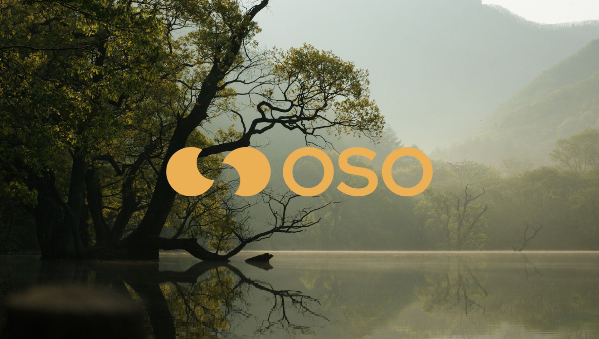
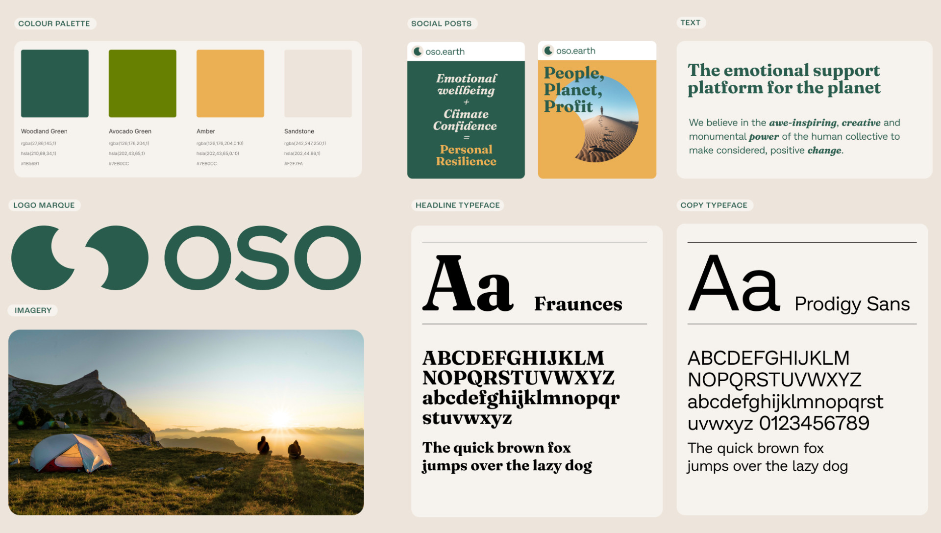
7DOTS approached the development of OSO's visual identity with careful consideration of the client's mission and target audience. Drawing inspiration from the client's emphasis on mental well-being and positive action, they designed a wordmark paired with a symbol. The symbol, an abstract depiction of the name 'OSO' utilising negative space, serves as a visual shorthand for the brand. It was designed to be versatile, recognisable, and memorable, even when used independently of the accompanying text.
Two typefaces, 'Fraunces' for headlines and 'Prodigy Sans' for longer form copy, were selected for their readability, approachability, and compatibility with the brand's personality. The colour palette was informed by a green tone as the primary colour, inspired by photography capturing people connecting with nature. The vintage colour grading of the imagery chosen for the brand's visual system produced earthy and organic tones, reinforcing OSO's connection to nature and sustainability.


