Casper
Creating a market-leading presence
Casper are a Managing General Agent insurance broker who provide specialist services to high-risk clients, specifically in the casualty sector. They came to 7DOTs to define a new brand strategy, create a more dynamic visual identity and build a best in class website .

The brief
The primary objective of the project was to effectively position Casper as one of the foremost casualty underwriters in the London market and provide a robust platform for future growth by creating a distinct, impactful, and memorable brand & visual identity for a complicated market challenger. Casper aspires to be renowned for their professionalism, client service and use of technology that allows its business to be conducted in a highly efficient manner.
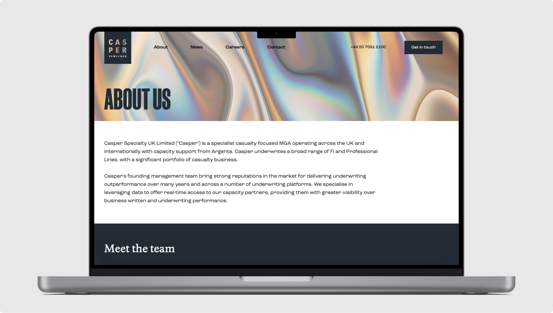
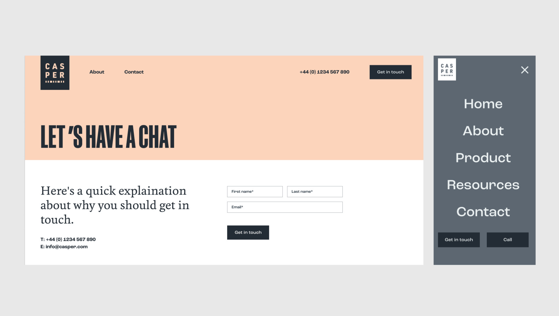
In addition, we would be building them a website as their primary new-business tool and thus would develop digital components befitting of our completed brand identity. To achieve this, the brand identity and website needed to reflect these values and provide a platform to meet these objectives.
Our approach
As with all our brand work, everything starts with strategy; understanding who our clients are, who they serve, and which motivations lay at both groups’ core. An intimate understanding of these ingredients is what differentiates a brand that successfully challenges from one that gets forgotten. With Casper, this detective work was no simple feat, but even more interesting as a result.
With no USP immediately obvious our first step was to conduct numerous immersion sessions and stakeholder interviews. These provided crucial detail in forming a picture of who the contributors were within their field and, notably, how their individual personalities contributed so greatly to their successes.
Bold, confident, charming, and charismatic, the team get things done through savvy industry smarts, excellent people skills and a lateral approach to solving often-complex market challenges. Thus, our positioning statement of “Expert judgement, ensuring confidence” laid the groundwork for setting them aside from their competitors, while providing a bold jumping-off point when moving into the visual identity phase.
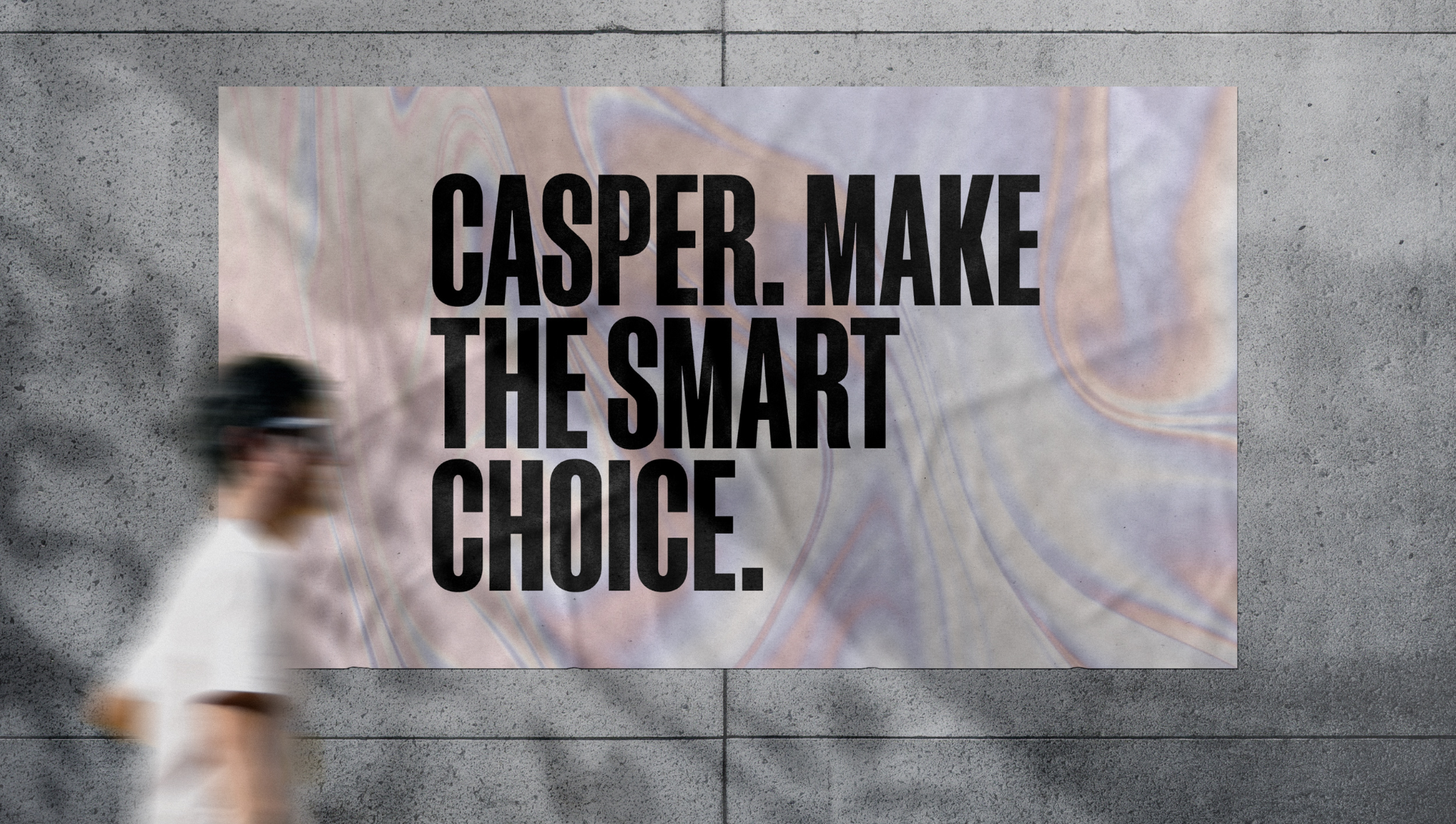
With a bold tone of voice in mind, an exploration of loud, authoritative typography led us to influences of mid-century information posters. We settled on a solution simple in its execution, but punchy enough to communicate in a voice far above the status quo - one reserved for the shoutier end of the B2B spectrum.
Visually speaking, we wanted a direction that felt at once authoritative but also characterful to reinforce the confident yet personable qualities of the team. We researched the historical practice of legal documentation - stamps, seals, signatories, and marks - and more recent security advancements like guilloche patterns, holograms, and metallic foils.

The build
Once branded, designs were handed over to the development team They then built out the design using modern best practices on Silverstripe. We opted for some simple animations to not overwhelm the user, but also make a serious site a little more engaging.

The outcome
The distinct and bold approach at first divided the team. We proved though, with scientific detail, how positioning a well-trodden story in a new voice is a brilliant recipe for capturing the hearts and minds of any audience.


